One of our demo files was featured at the 2012 FileMaker Developer Conference (DevCon), at Bob Shockey’s session “The Design Universe.” During the session folks requested a copy of that file, happily provided here. (Thank you Bruce R. & Kevin F. for the nudge to get this out!)
 To recap, this file shows a UI proof-of-concept using the new button states in FMP12. The general idea was to explore how to streamline complex Finds (that usually are multi-step processes) in a way that was iOS-friendly. I also wanted to see if it made sense to use the same UI on the desktop, to provide a more seamless cross-device experience. To demonstrate one such solution we used a single global field, OnObjectEnter script triggers, and a couple short scripts. [9/13/2012: added a straight button-driven method. ~Lee]

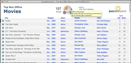
The use scenario is a casual user browsing a movie database. They don’t quite know what they want to see (no specific find criteria) so they will be using the “browsing” links provided to get ideas. True to mobile’s minimalist style, users interact by clicking (or tapping) directly on the content; the data fields ARE the “buttons” that initiate action. Users click/tap on “action” to see the list of movies with that genre, the director’s name to see a list of his films, etc.
The “pivot” descriptor comes from how a user in discovery mode interacts with a database. After each “find” the user sees different information that may take them in a completely new direction (hence, pivot). The user is rewarded with immediate results, with no extraneous criterion entry or navigation. The inherent difficulty with this more natural approach, however, is in how to construct the UI/UX for multi-criteria and complex (AND/OR/NOT) finds.

So we tried out the idea of “sticky-state” buttons. I was eager anyway to implement FileMaker Pro buttons that could provide immediate feedback in response to user actions. Through these buttons a user can build progressively more complex finds with just one click to change the Find condition. This “state change” must be indicated visually — and is where the new FM12 button-state feature is much appreciated!
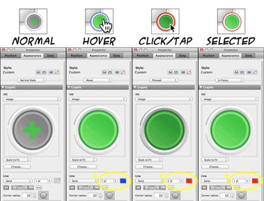
For our implementation, buttons maintain a visually-neutral (mostly) gray until they are called into action. I wanted the Hover state to dramatically command attention, and provide a satisfying confirmation of action when Pressing a button. For each button different images and outline colors distinguish the 4 available button states: Normal, Hover, Pressed and In Focus (Hover is n/a on FMGo, understandably). Each instance of the single field has a different set of background images — something not possible if we were using field contents to drive the UI.

The single global field never contains data; it is used only to capture OnObjectEnter triggers [or button actions in the updated version]. Any type of field would have worked for the background images but I used a global container field to avoid the blinking cursor when in-field.
[9/13/2012: The single global field now can act as a GoToObject target if using the button method that I now prefer. After various edits to the field layout objects, I discovered the triggers going off unexpectedly when clicking/tapping a completely different button. Buttons are more forgiving, methinks. 😉 ~Lee].
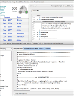
After handling the button graphics and the Find state-changes, the actual Find mechanism can be completely separated. Most of the script work in this demo was from creating a PivotBrowser Find history that could be navigated and restored. A portal to the right of the PivotBrower buttons displays the history. Click a prior line of the virtual-list based portal to roll back the Found Set to that point.
The download links for Top_500_Movies_wPivotDemo (FMP12): zipped, as usual and
UNzipped, for easy loading directly to your iPad.
Enjoy! (and please send me your feedback)
~ Lee Lukehart
