PivotBrowser UI demo from DevCon

One of our demo files was featured at the 2012 FileMaker Developer Conference (DevCon), at Bob Shockey’s session “The Design Universe.” During the session folks requested a copy of that file, happily provided here. (Thank you Bruce R. & Kevin F. for the nudge to get this out!)

button_parade_anim To recap, this file shows a UI proof-of-concept using the new button states in FMP12. The general idea was to explore how to streamline complex Finds (that usually are multi-step processes) in a way that was iOS-friendly. I also wanted to see if it made sense to use the same UI on the desktop, to provide a more seamless cross-device experience. To demonstrate one such solution we used a single global field, OnObjectEnter script triggers, and a couple short scripts. [9/13/2012: added a straight button-driven method. ~Lee]
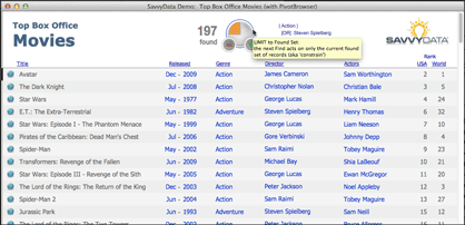
exploring a movie database
exploring a movie database (click image to enlarge)

The use scenario is a casual user browsing a movie database. They don’t quite know what they want to see (no specific find criteria) so they will be using the “browsing” links provided to get ideas. True to mobile’s minimalist style, users interact by clicking (or tapping) directly on the content; the data fields ARE the “buttons” that initiate action. Users click/tap on “action” to see the list of movies with that genre, the director’s name to see a list of his films, etc.

The “pivot” descriptor comes from how a user in discovery mode interacts with a database. After each “find” the user sees different information that may take them in a completely new direction (hence, pivot). The user is rewarded with immediate results, with no extraneous criterion entry or navigation. The inherent difficulty with this more natural approach, however, is in how to construct the UI/UX for multi-criteria and complex (AND/OR/NOT) finds.

Read More

Charting in FileMaker Go for iPad — what’s new in v2

Charting with FileMaker Go on the iPadWeb technologies have added functionality to FileMaker solutions since the Web Viewer layout object was introduced in version 8.5. The web viewer has proven especially useful for displaying Flash-generated charts from FusionCharts, Maani, AnyChart, and others.

FileMaker Pro v11 introduced a built-in chart layout object with 5 basic chart types. Charts suddenly became much easier to implement in FileMaker Pro!

However, with FileMaker Go for iPad and Phone (separate apps) built-in charting is not supported and Apple’s iOS doesn’t run Adobe Flash. The Google Charts API is popular, but for that you must be online.

Luckily, the potential of HTML5 for charting is huge, and the spec that affects charting functions (via the canvas tag) is fairly stable.

Read More

Fun with FileMaker Pro 11 Charts, v1.5

Knowing how to represent data visually often draws upon quite varied skills. A data visualist ideally possesses some of the traits of information architect, graphic designer, mathematician, statistician, web designer, teacher, user interface designer, cognitive psychologist, and storyteller. One could argue that these skills are essential to thriving in our future information-rich society. Until the future arrives, however, we must manage with whatever we have. And one thing we now have is FileMaker Pro 11 Charts! Charting is the feature that will drive a new stage of success.

The demo file explores using the chart object in new ways…

Read More

A Startup Subscript: Checking version/platform/device

Funny how a new platform (FileMaker Go for iPad, in this case) helps you tighten your code design. While putting together the Charting on the iPad demo file (updated), naturally I rewrote the subscript that checks versions at file start to include mobile devices. For each variation it can specify minimum version and whether to enforce, allow/advise, or deny any access. The script is more modular and easily extensible by app version, OS, OS version, or device form factor. It has four parts, essentially:

1. You decide your desired behavior rules:

# Whether to advise & allow, enforce version, or deny ANY access
# ( 0 or null=ignore, 1=advise but allow, 2=enforce version, 
#   3=deny ANY access, 4=unsupported platform but allow )

# Min version & enforcement level of FM Go for iPad
Set Variable [ $minVersion_FMGo_iPad; Value:"1.0" ]
Set Variable [ $enforceLevel_FMGo_iPad; Value:1 ]
# 
# Min version & enforcement level of FM Go (for iPhone)
Set Variable [ $minVersion_FMGo_iPhone; Value:"99" //will assure test fail ]
Set Variable [ $enforceLevel_FMGo_iPhone; Value:4 ]
etc., etc., etc.

2. Then you query the computing environment:

Read More

FileMaker Go (Charting?!) on the iPad

Charting with FileMaker Go on the iPad[ Update Note: As of Oct 7, 2010 the demo file links return an updated v2 file that was released at DevCon in August. This was discussed in a subsequent blog post, Charting in FileMaker Go for iPad — what’s new in v2 (ChartingWithWebTech.fp7). ]

Web technologies have added functionality to FileMaker solutions since the Web Viewer layout object was introduced in version 8.5. The web viewer has proven especially useful for displaying Flash-generated charts from FusionCharts, Maani, AnyChart, and others.

FileMaker Pro v11 introduced a built-in chart layout object with 5 basic chart types. Charts suddenly became much easier to implement in FileMaker Pro!

However, with FileMaker Go for iPad and Phone (separate apps) built-in charting is not supported and Apple’s iOS doesn’t run Adobe Flash. Sure, you can load static images from the Google charts API into a web viewer — but what is really needed is an interactive and self-sufficient (as in no internet connection required) charting solution.

Luckily, the potential of

Read More

Sparklines with FMP11 Charts – Updated

Reposted with updated file — Sparklines demo is more interactive, with informative dynamic tooltips.

Download link for the demo file: SavvyData_ChartFun.fp7.zip

Sparklines are “data-intense, design-simple, word-sized graphics,” as their inventor Edward Tufte describes them in his book Beautiful Evidence. Due to their form and format, sparklines are most appropriate on lists and subsummary reports, and are well suited to

Read More

Bar Charts on Steroids

The bullet graph is a horizontal bar chart on steroids. This device was invented in 2005 by Stephen Few of Perceptual Edge, as a response to dashboard widgets that take lots of screen space to provide one piece of information.

By contrast, the bullet graph can efficiently convey quantitative data such as goal & percent attainment, as well as qualitative measures such as how good or bad a score of “85” really is. The unusual aspect to this is

Read More