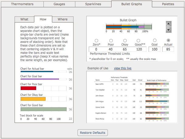
The bullet graph is a horizontal bar chart on steroids. This device was invented in 2005 by Stephen Few of Perceptual Edge, as a response to dashboard widgets that take lots of screen space to provide one piece of information.
By contrast, the bullet graph can efficiently convey quantitative data such as goal & percent attainment, as well as qualitative measures such as how good or bad a score of “85” really is. The unusual aspect to this is that assessment is rolled right into the chart. This helps viewers prevent oversight errors and avoid poor decision-making.

Check out a working example in the Fun with FileMaker Pro 11 Charting demo file:
